POWER OF COLOUR: Colours to use in your home this Christma

Despite the “influencer” interior trends of the last few years (think grey and white, simple designs with crushed velvet everywhere), colour is actually critical for a home’s interior.
Warm shades have been linked to feelings of excitement and delight, very on-brand for the autumn/winter. Red, for instance, is the colour of romance and passion, while purple is associated with creativity. Orange tones even stimulates appetite, making it perfect for the dining room or kitchen.
Cool tones, on the other hand, are associated with relaxation and calm.1 A light sky blue can evoke feelings of tranquillity, while green represents growth and renewal thanks to its association with plants.
If your current colour scheme is neutral as there are many bold complementary tones to accompany this palette – a few pops of colour in each room can dramatically change the mood.
With the long grey winter months fast approaching, leaving Brits feeling uninspired and sorely lacking for some Vitamin D and colour in their lives, the colder seasons are actually the perfect time for homeowners to add a little colour to their environment.
That’s why Berkeley Group explored the effect different colours and shades can have on people, and how to best select a colour scheme to beat those winter blues – and, most importantly, how to implement this with ease.
Do Your Homework
The best way to create a colour scheme that suits you is through research, which is why British colour expert Angela Wright recommends asking these five questions about every room in your house:
What colour do you want the room to be, primarily?
What secondary colour do you want the room to be?
Where do you want the point of interest to be? In patterns of wallpaper, curtains or furnishings or in different textures?
Does the room need to feel peaceful or stimulating?
What attitude do you have toward the main activity in this room: is it hard work or something you enjoy? (Either of these attitudes might, for example, apply to a kitchen.)
Balancing Colours
Life is all about balance, especially when choosing between primary and secondary colours. Consider the balance between hues with a shorter wavelength (typically blue, violet and green) and a longer wavelength (red).
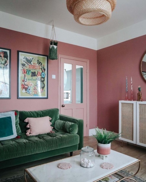
Various studies have suggested that entirely pink rooms can be physically draining, so balance the pink with a cooler secondary shade of green or blue. For some, black is considered a sophisticated colour, but Angela Wright warns: “Any occupant of a predominantly black bedroom will, eventually, start to feel oppressed and sluggish.”
To be sure colours complement each other – instead of clashing – use a colour wheel to check, there are plenty available online, even look to Pinterest or Instagram for some inspiration!
Keeping Up with the Trends
Social media determines a lot of interior trends – in fact, a lot of trends for most parts of popular culture these days – but influencers change their minds so quickly that it can make it tricky to know what’s coming next.
When picking a colour scheme, it might be worth considering the Colours of the Year, for example, Very Peri (Pantone), or Wild Wonder (Dulux), or using pops of trending colours / styles that elevate the interior design but don’t dominate.
Having said this, an analysis of the most Instagrammed photos of home decor by Livingetc found that the 15 most popular colours in the UK included seven shades of grey. This makes grey seem a safe option for a primary colour as it is also easy to complement with secondary shades.
Colour Associations
Trends come and go but one thing that seems to have always remained is the colour blue. Since the 1880s, when companies in Germany began surveying people’s colour preferences, blue has consistently been a favourite, usually followed by green.
This is likely because green can remind us of nature and also stimulate creativity, whilst blue we associate with blue skies and calm seas. Using light blue can make a room appear bigger, e.g., by painting a wall sky blue, it will appear further away, while green is welcoming for rooms where people gather often – such as the kitchen.
Colour Considerations
There are some rules to consider when choosing a scheme. One is to study how much natural light there is in a particular space: as a rule of thumb, cool whites suit sunnier rooms, and warmer whites are better for shadier spaces. It also pays, as Angela Wright suggests, to ensure that whatever colours you choose are balanced within rooms and across the house.
Sally Augustin, an American colour psychologist, designer, and consultant says a colour scheme should reflect your personality rather than the latest cool design trend. “If you’re an extrovert, you are more likely to enjoy bright, vivid saturated colours,” she says.
“But if you’re an introvert, because you’re relatively more efficient at processing visual stimuli, you’re likely to prefer more restrained colours.”
Whatever your ideas this winter, if you’re currently redecorating and looking for inspiration or are looking to move, take a look at the latest opportunities available across all of Berkeley Group’s property developments


